
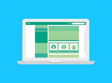
What is color shading?
First we need to understand what is color shading; you have noticed in webpages that whenever you are hovering on some elements and it's color shad and text color changes. That we call color shading and it is most important part of web designing.
It is like receptionist for your website; it makes your client or viewer feel special and treats his or her as a receptionist treats you.
If you do it right it will last forever
How is it useful?
With this type of shading it will give your site a mechanical appearance because in real life if you pick something in real life it's shade will change as it's distance from you decreases or increases.
So if you use this technique it makes your viewer feels like elements of your site going backwards and forwards with respect to the eyes of viewer.

How to do it?
There are two ways by which you can do it First one is to use different shades of same color and the second one is use different contrasting colors.
Let's talk about first if you use green color for any button or element and whenever you hover your cursor on it it changes color from green to light green of visa versa. Here with this dimension of button and text color should also be change to feel more dynamic.
For dimensions you can shrink element of enlarge element it's all on up to you while color of text should be between white or black; you can think of it as thumb rule to follow but you always can experiment.
Second way is little different because for dimensions and text color you can either follow thumb rule or you can experiment. For color of element you can choose two different and opposite colors like red- blue or yellow- green etc.
Remember within particular color shade of color is always matter and try not to use color directly rather use light shade or dark shade of color depending on appearance of other elements and visibility.
My world was the size of a crayon box, and it took every colour to draw her
-No Matter the Wreckage
What to take care of?
You need to understand that do not enlarge or shrink you element unnecessarily or avoid those things which makes harder to read and also take care of your colors because sometimes colors can annoy your clients like.
Also objective of website matters the most like if your website is for kids than you need to include bright colors and big font because kids like those things
While if you are creating website to sell product or service then your blog should be shaded in such a way that it drives the attention to your business part and not on to the other things.
If you wants to keep your client spend more time on it than you want to make it like a puzzle; give him or her more elements to explore.

- You can always use thumb rules.
- If you don't know much about colors then see other's website carefully.
- At the end of the day your site should be visible.
- Make your viewer curious not confuse.
Thank you guys to stick with it till the end and read whole course to create good website and stay with this blog to find new and helpful things in future.


0 Comments
Please make sure that your comment is authentic.